Customer Portal Design Principles for Shopify Subscriptions
Learn customer portal design principles for Shopify subscription stores. Covers self-serve UX patterns, accessibility, branding, and localization with examples.
Learn customer portal design principles for Shopify subscription stores. Covers self-serve UX patterns, accessibility, branding, and localization with examples.
A subscriber is standing in a supermarket queue, phone in one hand, trying to stop a delivery that no longer makes sense. The next box is already approaching, the Skip button is small, and the customer isn't sure whether tapping it will skip the next shipment, move the billing date, or create another charge. After a few failed attempts, the support inbox gets the message instead.
That moment is a practical test of customer portal design. A polished dashboard can still fail if a subscriber can't skip, pause, swap, change frequency, or update a payment method without assistance. For Shopify subscription stores, the portal has to connect a clear mobile experience with reliable account data, predictable billing logic, accessible controls, and a brand experience that doesn't feel like a vendor handoff.
Table of Contents
- The Moment That Reveals Whether Your Portal Works
- What Customer Portal Design Means for Subscription Stores
- Self-Serve Action Patterns Every Subscription Portal Needs
- Accessibility as a Functional Requirement, Not a Feature
- Hosting the Portal on the Merchant Domain
- Localization and Personalization Without Confusion
- How RecurX Approaches Portal Design on Shopify
- Measuring Whether Your Portal Redesign Worked
The Moment That Reveals Whether Your Portal Works
The strongest portal designs start with the task, not the screen. A subscriber usually isn't visiting an account area to admire a dashboard. They have a specific job, and the interface should make the next correct action obvious.
For a delivery that needs to be skipped, the first question is whether the subscriber means skip the next order or choose a specific future date. Those are different intents. Put both options behind a clear control, show the affected order date before submission, and make confirmation reversible. A short confirmation such as “Next delivery skipped, your following delivery is scheduled for [date]” gives the customer confidence without forcing them to contact support.
The same principle applies to the five recurring jobs that define subscription portal quality:
- Skip: Move one upcoming delivery without changing the underlying subscription.
- Pause: Stop renewals temporarily, with a visible resume condition.
- Swap: Replace a product or variant while exposing any price difference.
- Change frequency: Move between supported cadences without making the customer reconstruct the plan.
- Payment update: Repair a failed payment with a secure, focused recovery path.
Practical rule: Every primary action should answer three questions before the customer submits it: what changes, when does it take effect, and how can it be reversed?
The portal should also preserve a human escalation path. If a subscriber's request conflicts with fulfillment timing, inventory, a prepaid plan, or a billing state, the interface should explain the constraint and offer support with the relevant context attached. Hiding the exception creates frustration. Exposing it clearly protects trust.
A useful reference for mapping these subscriber jobs is this guide to managing subscriptions. The design standard is simple: routine changes should become successful self-service interactions, not tickets disguised as account management.
What Customer Portal Design Means for Subscription Stores
A subscription portal is more than an authenticated order-history page. A generic account dashboard lets someone view previous purchases, perhaps edit an address, and leave. Self-serve portal design gives the subscriber controlled write access to the recurring relationship itself.
That distinction matters because 67% of customers prefer self-service over speaking with a representative, according to industry reporting on customer portal expectations. A subscriber brings that expectation to every interaction. If the portal only displays information, the customer still has to email support to make the change that matters.
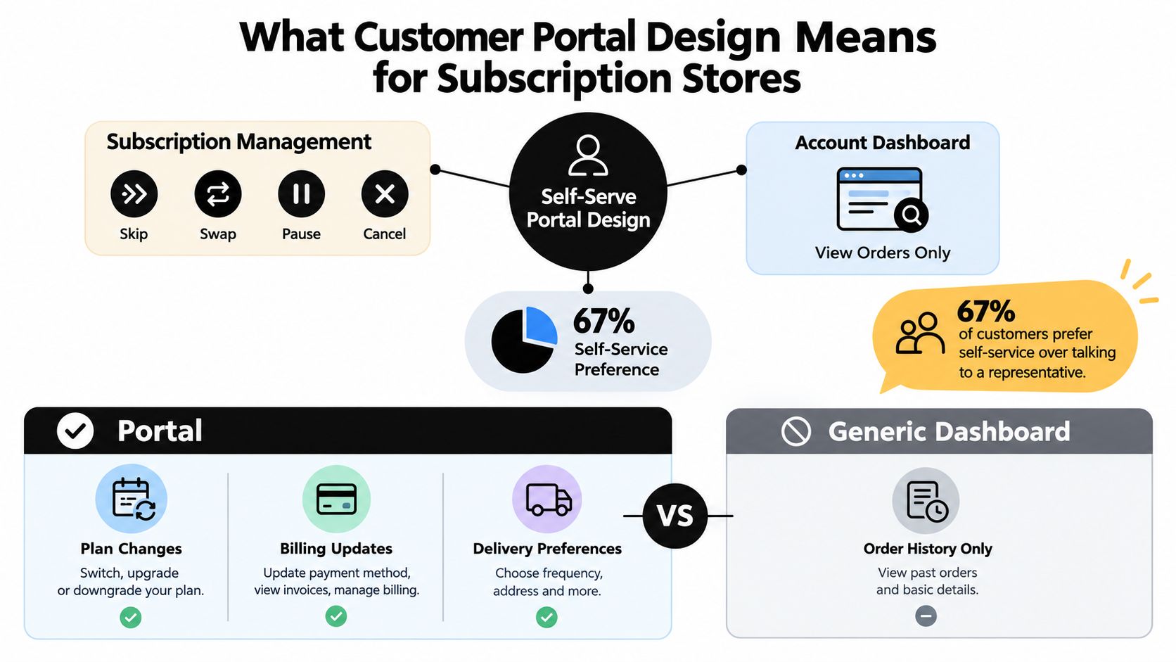
Recurring commerce raises the stakes. A one-time purchase creates a single service moment. A subscription creates repeated opportunities for confusion around delivery dates, product preferences, billing cadence, address changes, and payment recovery. A small usability defect can therefore return every renewal cycle until the subscriber cancels or asks support to intervene.
Good portal design treats those interactions as operational workflows:
- Task completion: The subscriber can complete a common change without assistance.
- Trust: Dates, prices, billing consequences, and inventory constraints are visible before confirmation.
- Accessibility: Keyboard users, screen-reader users, and mobile users can reach and recover from every action.
- Brand continuity: The authenticated experience still feels like the merchant's store.
- Data integrity: The portal reads from the subscription source of truth and writes changes back safely.
The technical foundation is equally important. Each customer must see only their own records, while actions such as status checks, address updates, document requests, and cancellations should write back to the relevant system rather than create a disconnected portal record. A read-only interface may look clean in a design review, but it leaves the most valuable work in the inbox.
Self-Serve Action Patterns Every Subscription Portal Needs
The five core actions below look simple in a wireframe. Their edge cases determine whether they reduce friction.
| Action | User Intent | Primary Control | Confirmation Pattern | Edge Case to Handle |
|---|---|---|---|---|
| Skip | Delay one shipment | Next-order skip with optional date picker | Show affected dates and allow reversal | Order already in fulfillment |
| Pause | Stop renewals temporarily | Preset duration or end-date selector | Display resume date and reminder preference | Prepaid or already-paid period |
| Swap | Change the product | Variant or product selector | Show replacement, price delta, and effective order | Replacement unavailable |
| Change frequency | Adjust delivery cadence | Stepper with supported intervals | Show next order date and billing effect | Anchor date or cadence restrictions |
| Payment update | Fix a failed or expiring method | Secure payment-method form | Confirm saved method and retry state | Decline, expired card, or failed retry |
Skip and pause need different mental models
Skip is an exception to the next shipment. Keep it close to the upcoming order, not buried in general settings. A single tap can submit the action, but the confirmation state should identify the skipped date and provide an undo path while the order remains editable.
Pause changes the subscription state. Offer sensible preset durations alongside a custom end date when the plan supports it. A subscriber shouldn't have to cancel because the portal doesn't offer a temporary stop. Show when billing resumes, and let the customer choose whether to receive a reminder.
Swapping and frequency changes need transparent constraints
For a swap, separate a variant change from a product-category change. A coffee subscriber moving from one grind to another has a different decision from someone replacing coffee with tea. Display the replacement name, quantity, fulfillment timing, and any price delta before confirmation. If inventory blocks the choice, explain why and offer eligible alternatives.
Treat change frequency as a stepper, not a freeform form. If the store supports weekly, monthly, or yearly intervals, present those as deliberate choices and update the next order date immediately. Don't make the customer type a cadence that the subscription engine may reject.
Payment recovery should continue after save
A payment form that says “saved” without explaining what happens next leaves the customer uncertain. Recognize the card network where the payment provider exposes that information, retry the charge according to the configured recovery logic, and distinguish between a saved method and a successful renewal.
The decline path should preserve the subscriber's work, explain the problem in plain language, and offer another payment method if available. A secure one-click update link in an email or SMS can bring the customer directly to the relevant portal state rather than the generic account home. For broader platform considerations, compare the customer portal software options against these actual subscription jobs, not just their template screenshots.
Accessibility as a Functional Requirement, Not a Feature
Accessibility changes the way subscription actions behave. It isn't a decorative layer added after the skip, swap, and pause flows are complete.
The European Accessibility Act took effect on June 28, 2025, and guidance for authenticated customer portals increasingly treats login, mobile apps, onboarding, statements, and digital support as part of the regulated experience. WCAG 2.2 AA is becoming the practical baseline for teams designing these flows, as explained in this accessibility case study for authenticated digital services.
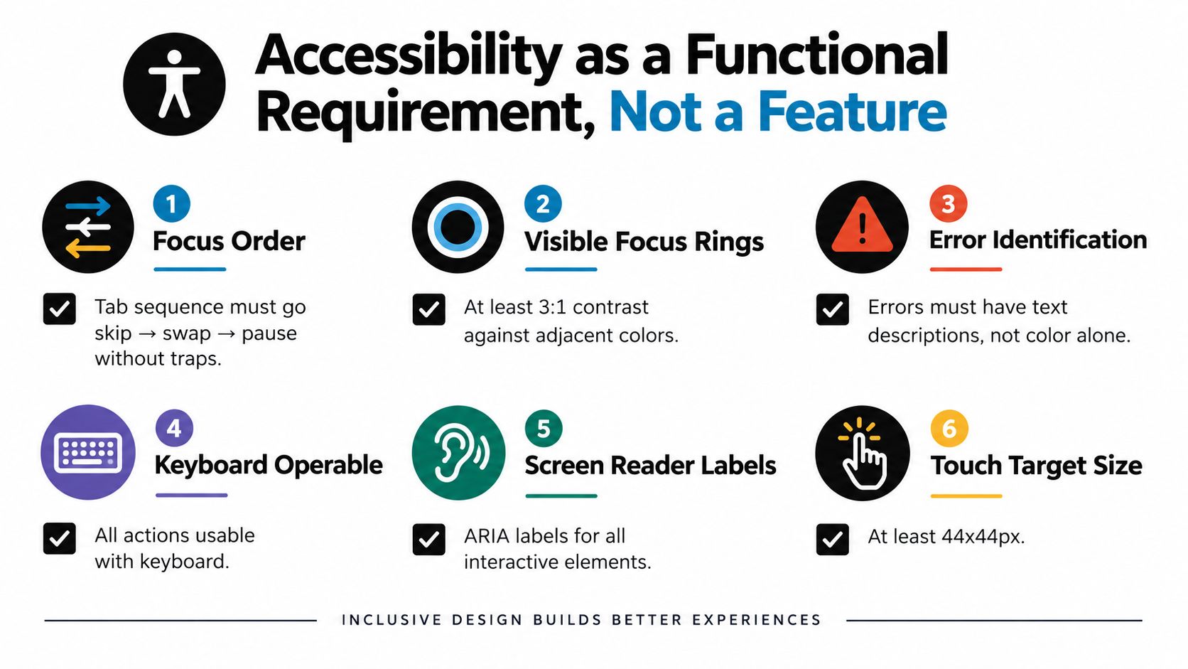
Translate the standard into implementation decisions:
- Focus order: Keyboard navigation should move through the task in a logical sequence, such as skip, swap, then pause, without traps.
- Visible focus: Focus rings need at least 3:1 contrast against adjacent colors, following the practical requirement described in the brief.
- Error recovery: Link error messages to the relevant fields with
aria-describedby, and identify the problem in text rather than color alone. - Confirmation announcements: Use an
aria-liveregion so a screen reader announces that a subscription was paused, skipped, or updated. - Touch controls: Use touch targets of at least 44 by 44 CSS pixels for one-handed mobile interactions.
- Payment timing: Provide a time-out extension for payment-update flows that take longer than 20 seconds, rather than discarding entered information.
A paused subscription should remain understandable without relying on green or red status colors. Use a text label, an icon with an accessible name, and a clear date. If a swap fails because inventory changed, place the explanation next to the control and return focus to the failed step.
These details protect more than compliance. An inaccessible portal blocks self-service, pushes customers toward support, and can make a recurring product feel impossible to manage. Accessibility review should therefore happen alongside payment, fulfillment, and retention review, with keyboard and assistive-technology testing on real subscription workflows.
Hosting the Portal on the Merchant Domain
A subscriber should know where they are. For Shopify stores, hosting the portal through the merchant's customer-account experience, such as brand.com/account/subscriptions, supports that recognition better than a vendor domain, an unrelated subdomain, or a sandboxed iframe.
The issue isn't only visual branding. An off-domain portal can interrupt session continuity, create a second login context, and make the subscriber question whether they're being sent to a third party to manage payment information. A merchant-domain experience keeps navigation, typography, account identity, and support paths aligned.
Shopify-native implementation changes the engineering calculus. Customer-account extensions can use the store's established design system, while customer-account API authentication tokens establish the account context. App Bridge supports embedded app interactions, and shared session handling avoids making the customer authenticate repeatedly. Teams still need to validate permissions, token scope, loading states, and error recovery, but they aren't rebuilding the entire account relationship outside Shopify.
| Criterion | Merchant-domain portal | Iframe or subdomain portal |
|---|---|---|
| Trust | Feels like part of the store | Can signal a vendor handoff |
| Session continuity | Uses the account experience as the primary context | May introduce separate authentication behavior |
| Brand system | Can inherit merchant design tokens and navigation | Often requires duplicated styling |
| Mobile behavior | Can be designed as one responsive account flow | Nested frames and redirects complicate interaction |
| Maintenance | Aligns portal changes with the Shopify account surface | Requires coordination across separate surfaces |
An iframe can accelerate an early proof of concept, but it often creates hard boundaries around focus management, responsive sizing, analytics, and cross-context error states. A separate subdomain may be workable for a broader support center, yet subscription controls deserve closer continuity because they affect billing and retention directly.
Merchants comparing login patterns should also review this customer portal login guide. The decision is less about making a portal look native and more about ensuring the customer never has to wonder whether the account action is connected to the store that charged them.
Localization and Personalization Without Confusion
Localization should help a subscriber complete a task, not make the interface feel unfamiliar. Detect the customer's market through Shopify Markets, display the appropriate currency and date format, and preserve the position of high-frequency controls.
A next-order message is a good example. “Your next delivery is on March 8” needs to adapt to the customer's locale, timezone, and preferred date convention without changing the meaning of the subscription state. If the delivery date is calculated in a merchant or warehouse timezone, convert it carefully and show the resulting local date rather than shifting the order.
Currency treatment requires the same discipline. Show the amount in the customer's local currency where the storefront and billing setup support it, explain any relevant exchange-rate behavior, and apply rounding consistently. Customers in EU markets should not discover a surprise adjustment only after confirming a swap or changing frequency.
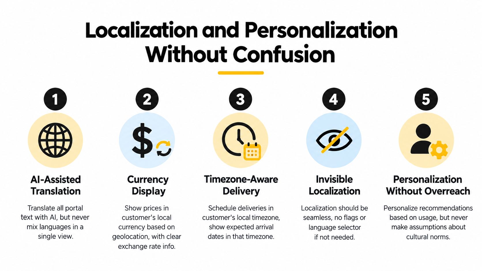
AI-assisted translation can speed up portal coverage, but brand voice and legal language need human control. Translate interface labels and explanatory copy with a glossary for product names, plan terms, and cancellation language. Don't machine-translate contractual or legally significant text without review.
Personalization deserves a hard boundary. A portal can recommend a likely swap or surface a payment reminder based on account context, but it shouldn't move Skip, Swap, and Pause around based on inferred intent. Predictability matters more than novelty for high-frequency actions. A subscriber who knows where the control lives can complete the task quickly and recover from mistakes.
For broader principles on adapting content to customer context without losing consistency, this e-commerce content personalization guide offers useful background. Test translated layouts with right-to-left languages before launch, including long labels, error messages, date controls, and confirmation states.
How RecurX Approaches Portal Design on Shopify
Subscription platforms differ less in their feature lists than in the amount of control they give teams over the customer-account experience. Legacy Recharge, Bold, Skio, and Loop implementations can provide useful primitives, but a fixed widget or off-domain flow can limit how closely the portal matches the merchant's Shopify architecture.
RecurX uses a customer-account extension approach for subscription actions such as pause, skip, swap, frequency changes, payment updates, and cancellation. Its available storefront tooling includes 20 widget templates, while its native Shopify architecture uses Polaris UI, App Bridge v4 hooks, JWT session tokens, and merchant-domain account integration. Those details matter when a team needs to validate keyboard flow, screen-reader announcements, and responsive behavior rather than accept a vendor template unchanged.
| Platform | Widget model | Domain hosting | Accessibility validation | Localization | Migration effort |
|---|---|---|---|---|---|
| RecurX | Configurable templates and account extension | Merchant domain | Contrast validation and workflow testing should be verified in implementation | Portal, widgets, and notifications support AI-powered translation | Direct connectors and CSV import are available |
| Recharge | Established subscription primitives and configurable components | Depends on implementation | Merchant team should validate the deployed flow | Depends on configuration and connected tools | Existing installations may require data and token planning |
| Bold | App-based subscription components | Depends on implementation | Validate the final storefront and account experience | Depends on configuration | Plan around current app and customer data |
| Skio | Subscription-focused templates and workflows | Depends on implementation | Validate keyboard and assistive technology behavior | Depends on configuration | Assess customer account and token migration requirements |
| Loop | Subscription widgets and management flows | Depends on implementation | Validate the deployed portal rather than the marketing claim | Depends on configuration | Map plans, customers, and payment states before cutover |
The table is an evaluation framework, not a substitute for a technical proof. Ask each vendor to demonstrate the exact flows your subscribers use. Can a keyboard user pause a plan and hear the confirmation? Can a subscriber swap to a higher-priced variant and understand the difference? Does a failed payment return to a recoverable state?
A migration can also expose hidden dependencies. Discount stacking, plan identifiers, customer tokens, fulfillment timing, and existing lifecycle automations all need mapping. The right platform is the one that lets the team ship a branded, accessible portal within its actual delivery window, rather than one that looks complete only in a design review.
Measuring Whether Your Portal Redesign Worked
A subscriber reaches the portal after a failed payment, wants to skip the next order, or needs to swap a product before renewal. That moment shows whether the redesign supports subscription work or merely presents a polished interface. Measure outcomes across the five jobs, not page views alone.
Industry sources report that well-designed self-service portals can deflect 40% to 60% of incoming customer queries, while mature programs can handle 45% to 55% of inbound support volume through self-service alone, as summarized in this customer support self-service statistics report. Use those figures as context, not as a guaranteed target for every store.
Build the scorecard around these measures:
- Ticket deflection: Compare subscription-related contacts before and after launch. Separate completed self-service actions from abandoned attempts.
- Pause-to-resume behavior: Track whether subscribers who pause later resume, and whether the pause flow exposes an avoidable cancellation signal.
- Payment-update completion: Measure how many customers with failed or expiring cards save a valid payment method before the next renewal.
- Time on task: Record completion time for skip, swap, and payment update, including validation errors and retries.
- Completion by device and assistive technology: Segment results so a strong desktop average does not conceal a broken mobile, keyboard, or screen-reader flow.
Capture a baseline during the two weeks before launch. Instrument each meaningful state: opening an action, selecting a value, reviewing the price or date impact, confirming, receiving an error, and completing the write-back. Review the results weekly during the first month, then fix the largest failure points rather than polishing low-impact screens.
The test plan should cover successful paths and exceptions:
- Skip an upcoming order, undo the change, and confirm that the original state returns.
- Pause with a preset duration, then test a custom end date.
- Swap to a higher-priced product and inspect the price disclosure.
- Change frequency across every supported cadence.
- Update a declined payment method and verify the retry state.
- Repeat every task on mobile, with keyboard navigation, and with a screen reader.
Published comparisons place an average self-service resolution at about $0.75, compared with roughly $12 for a live-agent interaction. Treat those figures as illustrative because each store's support costs differ. A portal that fails to complete tasks or reduce avoidable contacts is decoration, not retention infrastructure.
RecurX provides Shopify-native subscription management with a merchant-domain customer portal for skip, pause, swap, frequency changes, payment updates, and cancellation workflows. If routine changes still send subscribers to support, visit RecurX to evaluate a more connected approach to customer portal design and subscription retention.
customer portal design · Shopify subscriptions · subscription UX · portal accessibility · self-serve portal
Keep reading
- Strike Through Pricing That Actually ConvertsLearn how to use strike through pricing on Shopify to lift conversions, stay compliant, and run accessible Subscribe & Save offers without losing trust.
- Tiered Discounts ShopifyTiered discounts shopify. Learn how to set up tiered discounts on Shopify, including subscription ramps, anchor billing, and real examples
- 10 QR Codes in Advertising Ideas That ConvertExplore 10 practical qr codes in advertising ideas for print, packaging, events, and digital campaigns, with tracking and accessibility best practices.
Start growing recurring revenue on Shopify
RecurX has a free-forever plan and zero transaction fees on every tier. Install in minutes.
Install RecurX free →