Shopify Subscription Form How to Build and Optimize It
Learn how to create a high-converting Shopify subscription form with templates, accessibility, Build-a-Box and quick checkout tips.
Learn how to create a high-converting Shopify subscription form with templates, accessibility, Build-a-Box and quick checkout tips.
You've added a subscribe-and-save option to a Shopify product page, but the widget feels bolted on. The fonts don't quite match, the discount copy is vague, and shoppers can't tell whether they're choosing a recurring plan or a one-time purchase. After launch, the questions arrive: “When will I be charged?”, “Can I skip a shipment?”, and “Why did my subscription stop?”
That pattern is common because a Shopify subscription form isn't just a button. It's the first customer-facing step in a system that includes selling plans, checkout, customer accounts, payment recovery, and retention reporting. A form that looks native, explains the commitment clearly, and passes the right plan data through Shopify gives the rest of that system a stronger foundation.
Table of Contents
- Why Your Shopify Subscription Form Decides More Than Conversion
- Choosing a Template That Matches Your Theme Automatically
- Configuring Purchase Options Build-a-Box and Mixed Cart Logic
- Designing Accessible and Low Friction Customer Controls
- Connecting Quick Checkout Links QR Codes and Recovery Analytics
- Your Optimized Shopify Subscription Form Checklist
Why Your Shopify Subscription Form Decides More Than Conversion
A supplement brand can lose a subscription before checkout when the form hides the delivery interval. A coffee merchant can trigger support tickets by showing a discount without stating whether it applies to each renewal. A skincare store can make a returning buyer hesitate when the recurring option uses different typography, spacing, or control styles from the product page.
These are conversion issues with operational consequences. Poorly structured purchase options make it harder to identify which customers selected subscriptions, which selling plans they chose, and whether cancellations relate to price, product fit, or payment failure. Shopify's subscription analytics documentation explains that merchants can track recurring revenue, active subscriptions, new subscriptions, and canceled subscriptions across selectable 7-day, 30-day, and 90-day windows. That reporting is useful only if the form passes accurate selling-plan choices into Shopify's native flow.
The form is the beginning of the journey
The customer path runs as a single pipeline:
- A shopper sees the recurring option on the product page.
- The form explains price, frequency, renewal expectations, and cancellation controls.
- Shopify checkout receives the selected selling plan.
- The customer manages the subscription through the account experience.
- Your team reviews active contracts, new signups, cancellations, and recurring revenue.
- Failed payments enter a recovery workflow instead of becoming avoidable churn.
A generic “Subscribe and save” button addresses only the first interaction. A well-built Shopify subscription form supports the full path and gives shoppers a clear view of the billing decision before they commit.
The commercial case is also clear. A Shopify subscription commerce report describes subscriptions as a mainstream DTC pattern, reporting 58% of DTC brands offering subscriptions and Shopify subscription revenue growing 35% year over year. It also reports typical monthly churn of 7% to 12%, compared with 3% to 6% for top performers, and estimates subscriber lifetime value at $350 to $800 or more, versus $168 for one-time buyers. These figures are benchmarks, not promises. They show why improving both acquisition and retention can matter beyond the initial order.
Before checkout, the form should answer three questions: what am I buying, when will I be charged, and how easily can I change my mind?
For brands reviewing product-page friction, messaging, and customer behavior, Alpha Omega Digital's CRO services provide context for conversion-rate work beyond installing a widget. The practical standard is straightforward: build the form as a product decision interface that supports checkout, account management, analytics, and recovery, rather than treating it as decorative app code.
Choosing a Template That Matches Your Theme Automatically
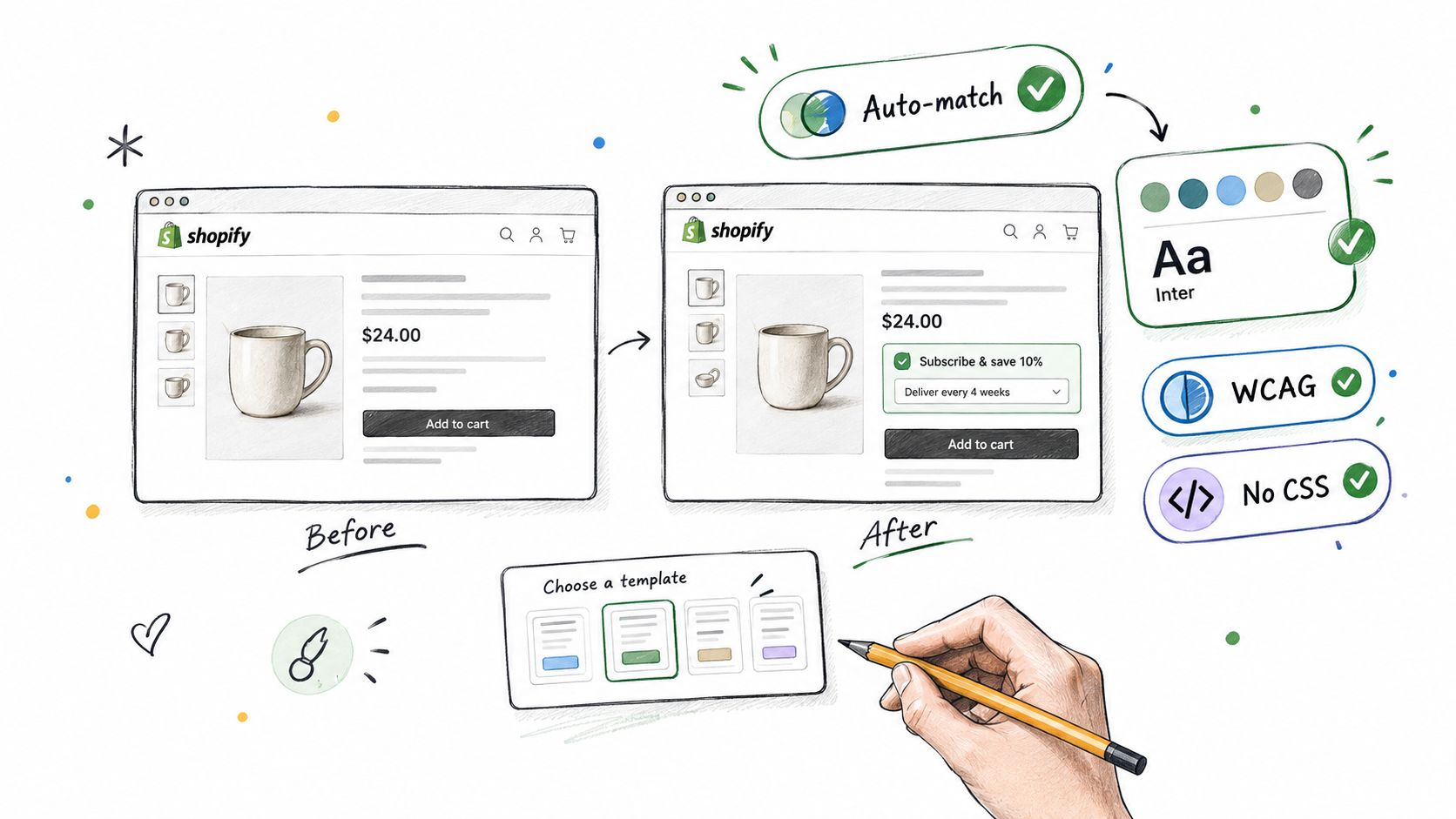
A subscription widget earns trust when it looks like it belongs to the store. Shoppers already understand the product page's visual language, including its type scale, button treatment, color hierarchy, and spacing. If the subscription selector introduces a separate design system, the customer has to reassess the purchase at the exact point where clarity matters most.
Start by previewing templates against the live theme, not a blank configuration screen. Compare the form beside the product title, price, variant selector, quantity control, and add-to-cart button. A template that looks polished in isolation may become dense on a product page with multiple variants or long ingredient information.
Match the form to the product decision
Use the product and its buying rhythm to choose the layout:
- For replenishment products, such as supplements or pet food, make frequency controls prominent. The shopper needs to compare one-time and recurring delivery without scanning a large block of copy.
- For premium skincare, keep the visual density restrained. The form should support price anchoring and explain the renewal benefit without competing with product photography.
- For coffee, give the delivery cadence enough room to accommodate taste and consumption differences. A compact selector can work, but cramped controls make several options feel interchangeable.
- For bundles, reserve space for product composition and quantity rules. A visually simple form can still become confusing when the customer is choosing a box rather than a single SKU.
Theme auto-matching reduces manual CSS work, but it doesn't remove the need for review. Check the form on a narrow mobile viewport, with long product names, multiple variants, and the store's actual discount language. Look for buttons that wrap awkwardly, labels that lose hierarchy, and selected states that rely only on color.
Contrast should be validated at render time because the active theme, section settings, and merchant styling can change what shoppers see. A design that passes on a white background may become difficult to read when placed inside a tinted product section. RecurX describes its widget library as 20 production-ready templates with theme color and font matching, plus WCAG-validated color detection. Treat those capabilities as a starting point, then inspect the rendered result yourself.
Practical rule: Native theme rendering usually creates more trust than an isolated iframe because the form shares the page's typography, spacing, and interaction context.
For performance, avoid adding layers that duplicate the product form or intercept checkout unnecessarily. The subscription selector should work with the theme's existing product form, variant selection, quantity logic, and cart behavior. If a template requires extensive overrides to look acceptable, choose another template before creating CSS debt.
A useful preview checklist includes:
- Typography: Headings, labels, prices, and helper text should follow the theme's visual hierarchy.
- Contrast: Selected states, borders, text, and error messages must remain distinguishable.
- Mobile density: Frequency and plan controls should be tappable without creating a tall, intimidating block.
- Error behavior: The form should explain what needs attention instead of failing.
- Speed: Theme-native output should appear with the product controls rather than loading as a disconnected experience.
The visual decision is complete when the shopper can understand the offer without noticing the app behind it.
Configuring Purchase Options Build-a-Box and Mixed Cart Logic
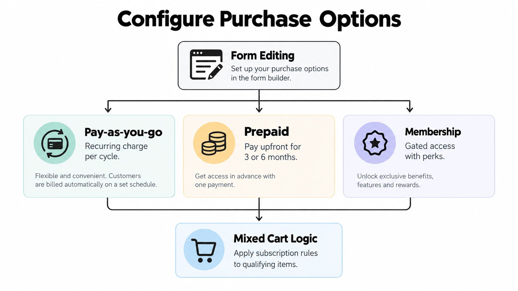
Once the form looks native, selling-plan logic becomes the harder problem. The same product page may need to support one-time purchase, pay-as-you-go subscriptions, prepaid commitments, memberships, or a custom Build-a-Box experience. The mistake is exposing every possible option without deciding which customer decision belongs first.
Begin with the commercial model, then map it to Shopify's product and selling-plan structure. A replenishment supplement may need recurring delivery with several frequency choices. A coffee company may need a box where shoppers select several products, while a membership brand may need gated access and renewal benefits rather than a simple shipment interval.
Choose the purchase model before the interface
Pay-as-you-go is usually the clearest default for physical replenishment. The customer pays each cycle and can manage the plan through the account experience. Display the recurring price, delivery interval, and renewal expectation together.
Prepaid plans require stronger upfront communication. If the customer pays for a block of deliveries, the form should state the amount charged today, what the payment covers, and what happens when the prepaid term ends. Don't present a prepaid option with the same label treatment as a monthly renewal plan.
Memberships need a different information hierarchy. The shopper may be paying for access, benefits, or eligibility rather than a shipment. Put the membership value near the selection control, and keep product delivery details separate if both exist.
Build-a-Box needs explicit rules
A coffee mix-and-match box is a good example. The customer might select several roasts, but the merchant still needs rules for minimum quantity, available variants, price calculation, and whether every item renews together. If those rules remain implicit, the form may look easy while checkout exposes an unexpected combination.
For a practical implementation pattern, the Build-a-Box setup guide is useful when deciding how the box builder should relate to product variants and subscription plans. Keep the customer's sequence logical: choose the box, select contents, choose one-time or subscription purchase, then confirm frequency and price.
A supplement bundle presents a different challenge. You may want a fixed group of products, a recurring discount, and a frequency choice, but the shopper should still understand whether the bundle is one subscription or several independent subscription items. The cart should preserve the intended selling-plan relationship rather than splitting the experience into unexplained line items.
Protect the native product form
The subscription selector must pass the selected selling-plan details through the storefront and into Shopify's cart and checkout flow. Avoid replacing the entire product form unless the implementation requires it and has been tested against variants, inventory behavior, accelerated checkout, and mixed carts.
Use these decision points:
- One-time and subscription together: Show a clear toggle or radio group, with the selected state visible without color alone.
- Subscription-only products: Remove the one-time option entirely instead of leaving a disabled control that creates doubt.
- Mixed carts: Define which items qualify for recurring billing and what happens when a shopper adds non-subscription products.
- Tiered discounts: Explain when the discount changes, especially if it ramps after a defined number of orders. The customer shouldn't have to infer the future price.
- Anchor-date billing: State the billing or renewal date in language that matches the actual implementation. A calendar-based promise that the backend doesn't honor creates avoidable disputes.
Test each configuration in a development theme and with real cart combinations. Confirm that the selected variant survives the option change, that the selling plan remains attached, and that checkout displays the expected recurring terms. Then inspect Shopify admin to verify the resulting subscription data is usable for reporting and support.
A form succeeds when it gives the shopper fewer decisions, not more settings. Put advanced choices behind an intentional flow, and make the default offer obvious without hiding material billing information.
Designing Accessible and Low Friction Customer Controls
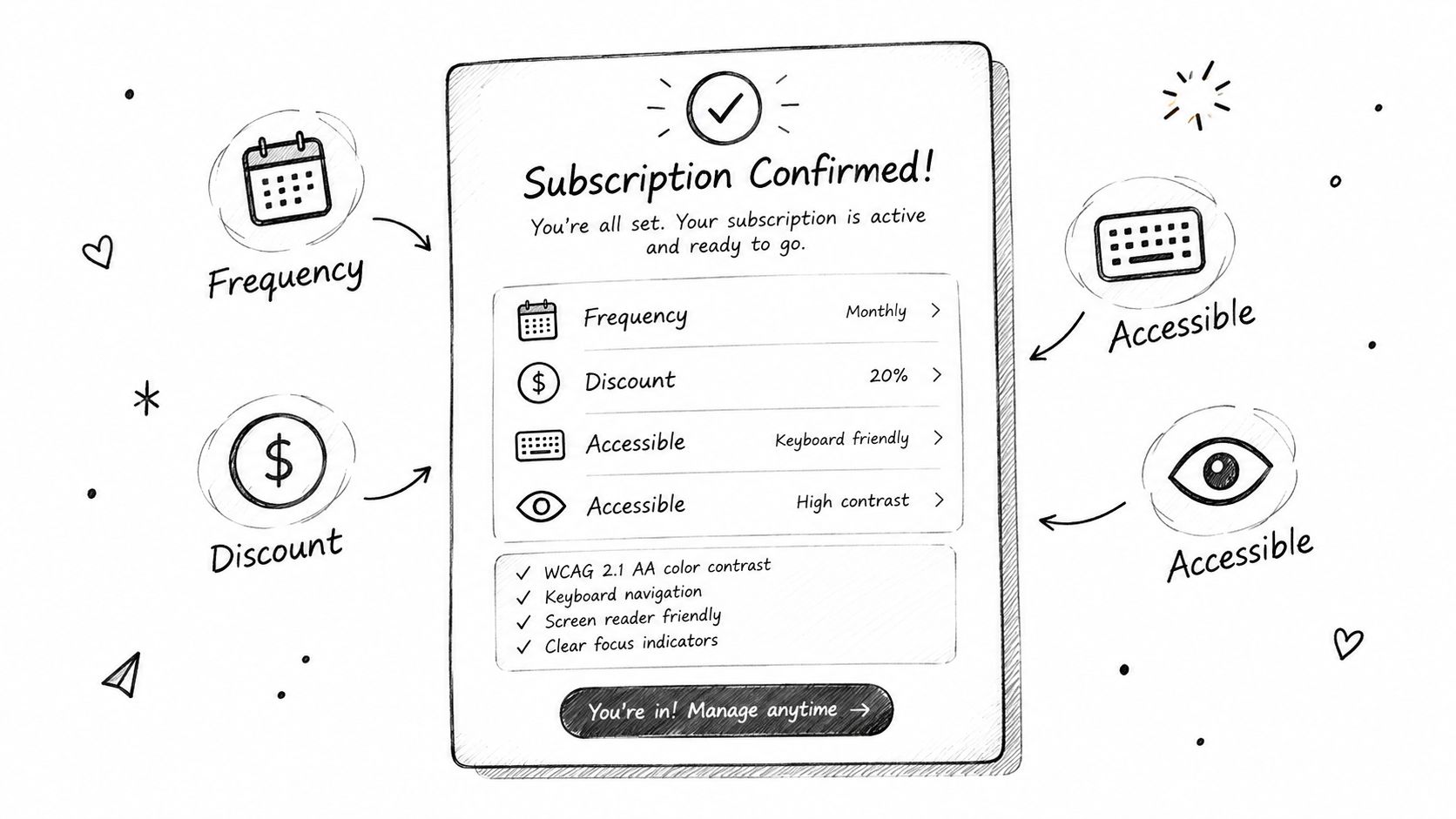
A subscription form asks for an ongoing commitment, so customers need visible control before they submit. Accessibility is part of that trust. If the selected plan is identified only by a subtle color change, keyboard users and shoppers with visual impairments may not know which option is active. If the frequency label is separated from the price, every customer has to work harder to understand the offer.
Use a semantic control for each purchase choice, with a visible label and a clear selected state. Keyboard navigation should follow the same order as the visual layout. Focus indicators must remain visible against the theme background, and error messages should identify the affected field rather than appearing as a generic alert above the form.
Explain the commitment in plain language
A low-friction form answers the questions customers usually ask support:
- What will I pay today? Show the current charge clearly.
- What will I pay later? State the renewal price or explain how it changes.
- How often will it renew? Use direct language such as delivery every month or renewal every four weeks, depending on the actual plan.
- Can I pause or skip? Mention the available control near the purchase decision.
- Can I swap products? Say so when the portal supports product changes.
- How do I update payment details? Point customers toward the native account experience rather than suggesting they contact support.
Don't bury important terms in a tooltip that disappears on mobile. Helper text can stay concise, but it needs to appear close to the relevant control. A discount label such as “save on subscription” is weaker than copy that explains the recurring price and when the benefit applies.
Design the post-purchase experience into the form
The portal isn't a separate support project. Customers judge the subscription offer partly by how easy it is to manage after purchase. Pause, skip, swap, frequency changes, and payment updates should be available through the merchant's domain and integrated with the Shopify customer-account experience where the implementation supports it.
The customer experience optimization guidance from Silver Spoon Agency provides broader context for reducing friction across ecommerce journeys. Applied to subscriptions, the principle is practical: make the next action obvious, preserve context, and avoid sending customers into an unfamiliar interface.
A clear form can preview the controls without turning the product page into a portal manual. For example, a short line below the plan selector can say that customers can pause, skip, or change frequency from their account. That reassurance reduces perceived commitment while keeping the primary purchase decision focused.
For merchants selling across markets, translate widget labels, portal actions, renewal notices, and payment-recovery messages as a coordinated set. A translated form paired with an untranslated portal creates confusion after purchase. RecurX includes AI-powered translations for widgets, customer portals, and notifications, but any automated translation still needs review for billing terminology and local expectations.
Accessibility is not a visual polish pass. It affects whether customers can identify a plan, complete checkout, and manage the commitment without assistance.
Before publishing, test with the keyboard, zoom the page, inspect focus states, trigger validation errors, and read the form with a screen reader. Then complete the flow on mobile with a slow connection. A form that works only in the ideal path isn't ready for production.
For deeper portal design decisions, see the customer portal design resource. The important boundary is clear: the product page earns informed consent, while the account experience makes that consent manageable.
Connecting Quick Checkout Links QR Codes and Recovery Analytics
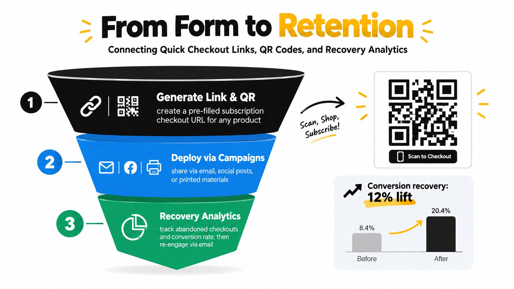
A subscription campaign may begin in an email, social post, printed insert, or QR code on packaging rather than on the product page. Sending every shopper to a general product page adds another decision layer, especially when the campaign already identifies the product, variant, and subscription plan.
A pre-built subscription checkout URL carries that intent into checkout. QR codes apply the same route to offline placements. Preserve the selected product and selling-plan details, then add campaign naming or tagging so the team can separate sources in later reporting. That turns the form into the first step of a retention pipeline, not an isolated button.
Match the entry point to the customer's intent
| Entry Point | Best For | Trade Off |
|---|---|---|
| Product-page form | Browsing shoppers comparing variants, one-time purchases, and subscription plans | Gives customers more context, but asks them to make more decisions |
| Quick checkout link | Email, SMS, retargeting, and campaign traffic with a specific offer | Reduces steps, but provides less product education |
| QR code | Packaging, events, inserts, and offline promotions | Connects offline attention to checkout, but depends on clear surrounding instructions |
Use the product-page form while shoppers still need to compare the product, variants, one-time purchase, and subscription terms. Use a quick link after the campaign message has already established the product and offer. Use a QR code when the physical placement is the marketing surface, and make the destination clear before the scan.
The Shopify subscription checkout links guide explains how to use pre-filled subscription URLs and QR-based entry points. Test every route on mobile, confirm that the intended plan is selected, and check that accelerated checkout does not skip required subscription disclosures. Also test discontinued products, unavailable variants, and links copied from older campaigns.
Measure the pipeline after the click
Shopify's subscription reporting can separate active contracts, new subscriptions, cancellations, and recurring revenue across 7-day, 30-day, and 90-day windows, as documented in its subscription analytics help center. Review those measures together:
- Acquisition: Which entry point creates new subscriptions?
- Retention: How does the active base change over time?
- Churn: When do cancellations rise, and what reasons do customers provide?
- Revenue planning: How does recurring revenue move alongside new signups and cancellations?
Payment recovery belongs in the same operating view. Independent benchmark reporting says 4.63% of subscription payment attempts fail on the first try in the U.S., and subscription businesses lose around 9% of monthly recurring revenue to failed payments. The failed-payment benchmark summary also reports that automatic retries alone recover about 30% of failed payments, while coordinated retries and dunning can recover more.
A separate industry summary reports that 62% of users who encounter a payment error never return to the site. Its subscription payment recovery guidance supports a workflow that captures intent, reduces checkout friction, monitors failed and recovered payments, and sends email or SMS recovery messages.
RecurX is one Shopify-native option combining subscription widgets, selling plans, customer-account controls, quick checkout links, QR codes, analytics, and recovery workflows. Evaluate it against the theme, checkout requirements, support process, and reporting needs. The widget is only one part of the implementation.
Your Optimized Shopify Subscription Form Checklist
A strong implementation doesn't require the most complicated form. It requires the right information to appear at the right moment, followed by reliable data and recovery processes after checkout.
Use this launch sequence:
- Start with theme fit: Preview templates beside real product content, check typography and spacing, and remove any design that needs extensive custom CSS.
- Validate accessibility: Test keyboard navigation, focus states, contrast, labels, zoom behavior, and error messaging on the rendered storefront.
- Clarify the offer: Show one-time and recurring prices, delivery frequency, renewal expectations, discount rules, and the customer's immediate charge.
- Test selling-plan integrity: Confirm that variants, quantities, subscription choices, and mixed-cart behavior survive the move from product form to cart and checkout.
- Keep Build-a-Box rules visible: State minimums, eligible products, bundle pricing, renewal behavior, and what happens when a shopper changes box contents.
- Design for control: Tell customers where they can pause, skip, swap products, change frequency, and update payment details.
- Add campaign entry points: Use product-page forms for comparison, quick checkout links for focused campaigns, and QR codes for offline placements.
- Instrument the full funnel: Review new subscriptions, active subscriptions, cancellations, recurring revenue, failed payments, recovered payments, and churn reasons in the reporting environment your team already uses.
Avoid the common front-end-only mistake. A beautiful widget can still produce poor outcomes if checkout loses selling-plan data, the portal creates support friction, or failed payments receive no recovery treatment. The form should make the first decision easy, while the surrounding Shopify-native workflow protects the relationship afterward.
Launch with a focused offer, observe opt-in and cancellation behavior, and iterate based on actual customer questions. RecurX provides Shopify-native subscription plans, theme-matched widgets, Build-a-Box flows, customer-account controls, checkout links, QR codes, analytics, and payment-recovery tooling, with zero transaction fees stated across its plans.
RecurX can help you connect the Shopify subscription form to selling plans, customer management, quick checkout entry points, analytics, and payment recovery in one Shopify-native workflow. Visit RecurX to review the available subscription tools and choose an implementation that fits your storefront and retention process.
shopify subscription form · shopify subscriptions · subscription widget · shopify how to guide · recurx
Keep reading
- How to Set Up Recurring Payments on ShopifyLearn how to set up recurring payments on Shopify the right way. Covers gateways, tokenization, dunning, retries, and monitoring MRR and churn.
- Shopify Subscription Theme Explained and How to ChooseLearn what a Shopify subscription theme is, how it works with apps like RecurX, and how to choose a Shopify subscription theme that converts.
- Shopify Subscription Template Setup Made SimpleLearn how to implement and customize your Shopify subscription template with RecurX widgets, theme matching, and QA tips for higher conversions.
Start growing recurring revenue on Shopify
RecurX has a free-forever plan and zero transaction fees on every tier. Install in minutes.
Install RecurX free →