Shopify Subscription Theme Explained and How to Choose
Learn what a Shopify subscription theme is, how it works with apps like RecurX, and how to choose a Shopify subscription theme that converts.
Learn what a Shopify subscription theme is, how it works with apps like RecurX, and how to choose a Shopify subscription theme that converts.
You've chosen a polished Shopify theme for your coffee, supplement, or skincare store. The product page looks ready, the colors fit your brand, and the launch date is close. Then you install a subscription app and discover that the Subscribe & Save option doesn't appear, disappears when a shopper changes variants, or adds a one-time item to the cart instead of a recurring purchase.
That problem rarely starts with the color palette. It starts with the connection between the theme and Shopify's subscription system.
A Shopify subscription theme needs to do more than display an attractive product page. It must support selling plan selection, respond correctly when product variants change, and show subscription details in the cart. If one part fails, shoppers may never understand what they're buying, and your team may need custom fixes after launch.
The practical way to choose a theme is to evaluate its subscription plumbing first and its visual polish second. This guide explains what subscription-ready architecture means, how the storefront components work together, which theme features to test, and how to assess the effects on the wider subscriber experience.
Table of Contents
- Introduction Why Your Theme Decides Subscription Success
- What a Shopify Subscription Theme Actually Is
- How Subscription Plumbing Works Inside Your Theme
- Why Storefront Matching and Accessibility Matter for Conversions
- How to Evaluate and Choose a Shopify Subscription Theme
- Connecting Your Theme to the Full Subscription Experience
- Final Takeaways for Choosing Your Subscription Ready Theme
Introduction Why Your Theme Decides Subscription Success
A merchant can spend days refining a product page only to find that the subscription selector is missing from the live storefront. The app may be installed correctly, the product may have a selling plan, and the theme may look perfect. Yet the customer still sees only the one-time purchase option.
Another common failure appears when a product has several sizes, flavors, or strengths. The subscription option works for the default variant, but changing from a small bag of coffee to a large bag removes the plan or leaves the wrong price in place. The shopper clicks Add to cart and assumes the recurring order is active. The cart tells a different story, or no subscription information appears at all.
These aren't cosmetic defects. They affect the customer's understanding of the purchase and create operational risk for the merchant. Shopify's documentation identifies three essential storefront requirements: a selling plan selector on the product page, JavaScript that updates the selling plan when variants change, and a cart display that shows the selected selling plan. Shopify's subscription setup guidance also states that subscription products require a sections-and-blocks compatible theme, with only certain free themes explicitly supported.
The broader ecosystem makes testing especially important. Store Leads' Shopify theme and store report tracks more than 3.1 million live Shopify stores in 2026 and over 4,000 distinct themes, while the three most common tracked themes account for 15.6%, 9.0%, and 5.7% of stores respectively. A separate store-level analysis in the same verified data found Dawn on 24.5% of stores in one dataset, with 59.1% of themes classified as free, 24.3% paid, and 16.5% custom. A widget that works beautifully in one theme can behave differently in another.
The right evaluation sequence is simple:
- Understand what subscription-ready architecture includes.
- Trace the selling plan from product page to cart.
- Check whether the widget matches the theme and remains accessible.
- Test variant changes, cart display, and customer-facing management before committing.
- Choose a theme and subscription app that reduce custom code rather than creating another maintenance project.
What a Shopify Subscription Theme Actually Is
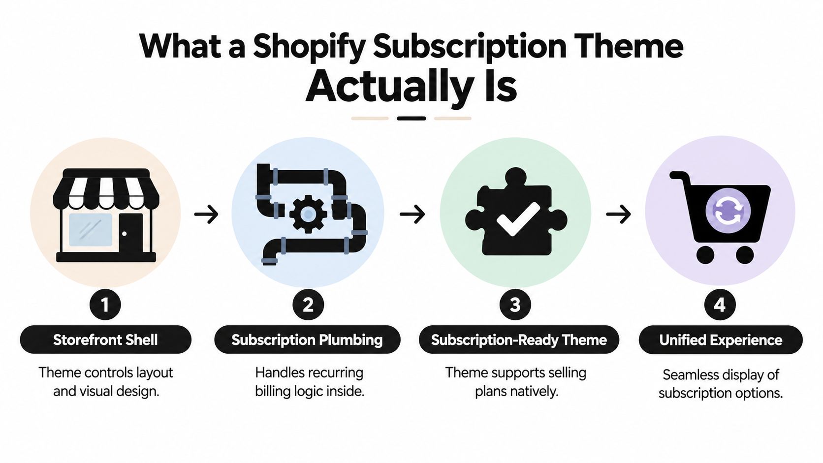
Think of your Shopify theme as the visible shell of a physical shop. It controls the shelves, signs, lighting, navigation, typography, and general appearance. Subscription functionality is the wiring behind the walls. It carries information about recurring purchase plans, selected variants, cart attributes, and checkout behavior.
A normal Shopify theme can display products without supporting that wiring correctly. A subscription-ready theme gives the subscription app the right places and behaviors to connect its components without forcing a developer to hard-code a widget into the theme.
The four parts of a subscription-ready storefront
The distinction becomes clearer when you separate the storefront into four connected layers:
- Storefront shell: The theme controls the layout and visual system shoppers see.
- Subscription plumbing: The app and Shopify selling plans handle recurring purchase logic.
- Theme compatibility: The theme provides sections and blocks where the subscription interface can render.
- Unified experience: The product page, cart, and checkout communicate the same purchase choice.
The key technical standard is Shopify's theme app extension system. Shopify describes subscription experiences as theme extensions made from app blocks and app embed blocks. Merchants can add app blocks through the theme editor without editing theme code, and Shopify states that new App Store apps must use theme app extensions for online-store theme integration. Shopify's theme app extension configuration documentation explains why this architecture has replaced many older, hard-coded installation methods.
An app block is useful because it gives the merchant control over placement. You might put a subscription selector below the price, beside the quantity control, or near product benefits, depending on the theme's product template. An app embed block can support functionality that doesn't belong in one specific content area.
Why sections and blocks matter
Shopify's subscription documentation describes a dedicated theme extension for displaying a subscription plan selector on product pages. Buyers can choose a subscription and add it directly to the cart, while app blocks inherit theme styling such as typography and colors. That means the subscription interface can look native while remaining controlled through the theme editor.
A theme that supports sections and blocks gives you a safer starting point. You can install, place, preview, and remove the subscription component without scattering manual code across product templates. This doesn't guarantee perfect behavior, but it makes testing and maintenance much more manageable.
Practical rule: A theme is subscription-ready when it supports the subscription app's extension architecture and preserves the selling plan through the shopper's full purchase path.
How Subscription Plumbing Works Inside Your Theme
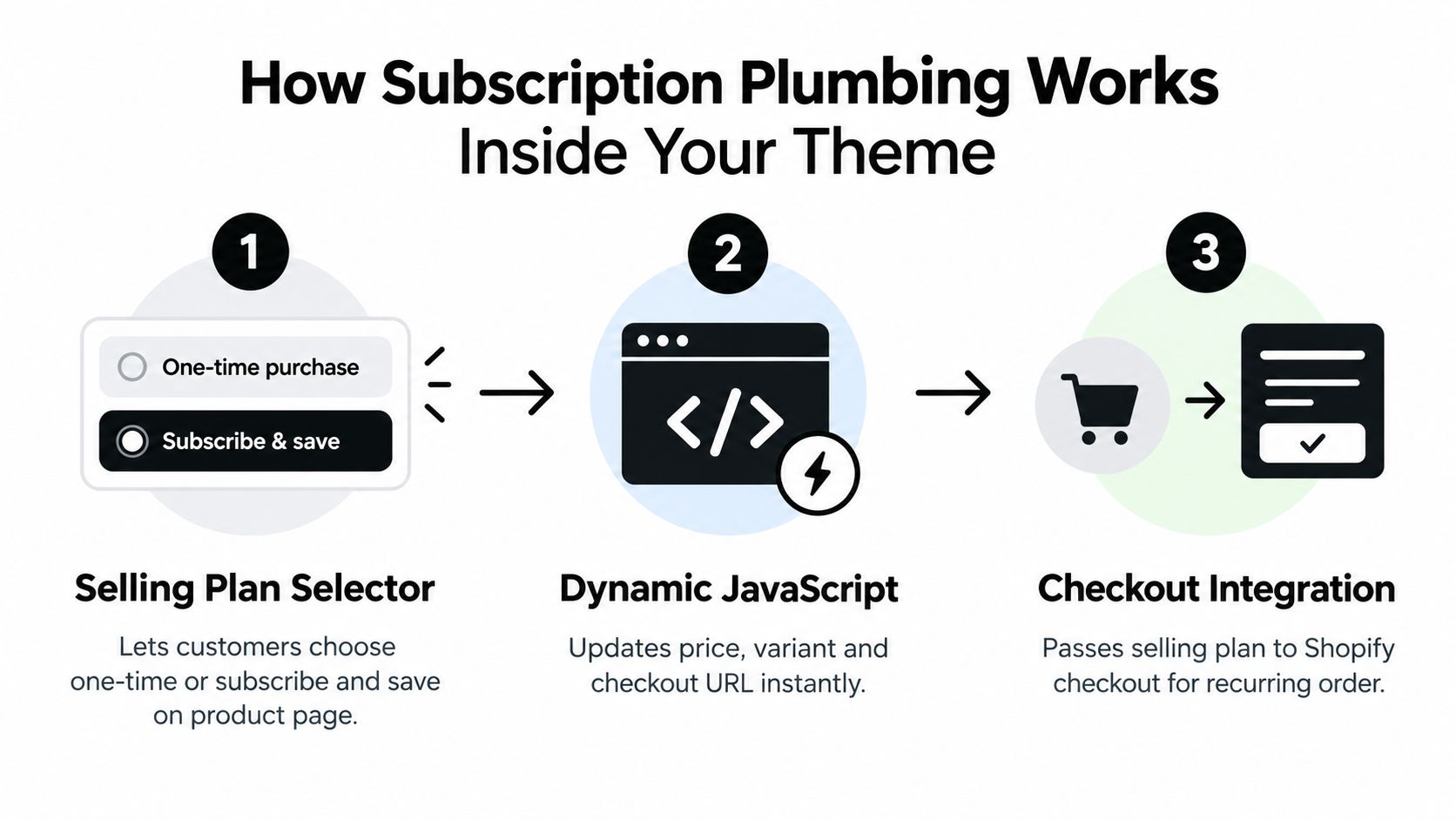
Subscription functionality follows a short chain. The product page presents the available purchase choices. The theme and app update those choices as the shopper changes the product. The cart then records and displays the selected selling plan before checkout receives it.
Break that chain at any point and the customer may complete a purchase that isn't the one they intended.
The selling plan selector
The first component is the selling plan selector on the product page. It lets a shopper choose between a one-time purchase and a recurring option, such as delivery every month. The selector needs to connect the chosen plan to the specific product variant, not merely show static text beside the Add to cart button.
A useful selector answers practical questions without making the shopper search:
- What is the recurring option?
- Which delivery frequency applies?
- How does it differ from buying once?
- Can the shopper change the choice before adding the item?
The app block should sit close enough to the product form that the relationship is obvious. If the selector appears in a distant accordion or an unrelated section, shoppers may not understand that it controls the purchase button.
Variant-aware JavaScript
The second component is the JavaScript that responds when a shopper changes variants. A supplement store might offer different capsule counts. A skincare store might offer different sizes. A coffee store might offer different roasts or bag weights.
The selling plan must remain attached to the selected variant, and the product form must update the relevant identifiers and purchase information. If the script only works for the default variant, the interface can look functional while sending incomplete or incorrect data to the cart.
This is why a static screenshot isn't a sufficient compatibility test. Select a recurring option, change the variant, change the frequency if available, and then inspect the price, selection state, and Add to cart behavior after every change.
Shopify theme work can become technical quickly, especially when a custom product form or nonstandard variant picker is involved. A practical guide for non-technical founders can help merchant teams understand where theme configuration ends and custom development begins. For teams reviewing the broader platform layer, Shopify integrations and API considerations provide useful context for how storefront behavior connects with admin and checkout workflows.
Cart visibility
The third component is the cart display. The cart should show that the item is part of a subscription and identify the selected plan or frequency. Without that confirmation, shoppers can lose confidence at the last step, and support teams may receive questions about what will be charged or shipped.
Test the cart on both desktop and mobile. Check drawer carts, full-page carts, quick-add flows, and any cart upsell components. A theme may support the main product form while a quick-add component bypasses the subscription selection entirely.
If the product page promises a subscription but the cart doesn't confirm it, the storefront has an incomplete purchase flow.
Why Storefront Matching and Accessibility Matter for Conversions
Functional compatibility gets the customer into the subscription flow. Presentation determines whether the option feels trustworthy enough to use.
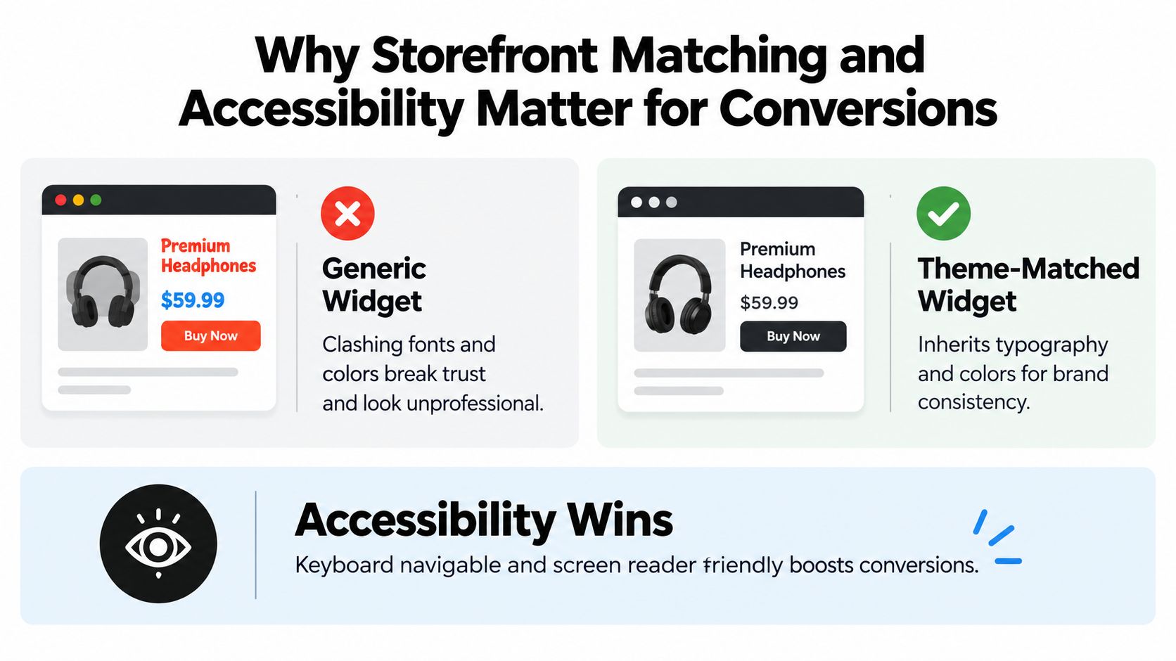
A generic widget often arrives with its own font sizing, spacing, borders, and colors. On a carefully designed storefront, that block can look like an external insert. Shoppers may hesitate when the subscription selector appears disconnected from the product title, price, and purchase controls.
A theme-matched widget behaves differently. It uses the storefront's existing visual language, so the subscription choice feels like part of the product page rather than an afterthought. Shopify notes that app blocks inherit theme styling such as typography and colors, which allows subscription interfaces to align with the theme while remaining configurable through the editor. Shopify's subscription extension documentation describes this relationship between app blocks and storefront styling.
Generic and adaptive widgets
The difference isn't only aesthetic. It affects comprehension, accessibility, and future maintenance.
| Generic widget | Theme-matched widget |
|---|---|
| Uses its own visual assumptions | Adapts to the storefront's typography and colors |
| May clash with buttons and price blocks | Fits the product page hierarchy |
| Can require manual styling after a theme change | Uses the theme's available styling context |
| May create contrast or focus-state problems | Can be tested against the storefront's accessibility needs |
Low contrast creates a practical barrier. A muted label beside a pale background may technically exist but still be difficult to read. Keyboard users also need a clear focus state and usable controls, while screen reader users need meaningful labels for the purchase options.
Accessibility testing should include the selector, frequency controls, variant picker, and cart confirmation. Don't test only the desktop default state. Check mobile layouts, expanded and collapsed controls, error messages, and the appearance after a variant change.
RecurX provides an example of the kind of implementation merchants can evaluate: its publisher information describes 20 widget templates that auto-match theme colors and fonts, with contrast validated at render time. That fact doesn't remove the need for merchant testing, but it gives teams a concrete benchmark for what theme adaptation should look like. For a closer look at the customer-facing component, see this Shopify subscription form guide.
A subscription selector should look native, read clearly, work with a keyboard, and remain understandable after every product choice changes.
The Shopify ecosystem is fragmented, so one universal styling assumption is unlikely to fit every storefront. A merchant using a free theme may need different placement and spacing from a merchant using a paid or custom theme. Theme adaptation protects brand consistency, but accessibility still needs verification in the actual store.
How to Evaluate and Choose a Shopify Subscription Theme
Choose a theme by testing the subscription path, not by judging the homepage preview. A theme can look excellent in the Theme Store and still create problems in the product form, cart drawer, or mobile layout.
Start with the theme architecture. Confirm that the product template supports sections and blocks and that the subscription app exposes a theme app extension. Shopify's current integration model expects app blocks or app embeds for online-store theme functionality, so a setup that requires editing several Liquid files deserves extra scrutiny.
A practical pre-installation test
Use a representative product rather than a blank test item. For a coffee brand, choose a product with multiple roasts or sizes. For skincare, choose a product with different quantities. The test should reflect the combinations real customers will use.
- Open the theme editor. Look for the app block or app embed supplied by the subscription app.
- Place the selector near the product form. Confirm that the block renders in the intended position without disturbing price, quantity, or purchase controls.
- Select a recurring plan. Verify that the interface clearly shows the selected state and any applicable purchase information.
- Change the variant. Watch the price, selected plan, product identifier, and button state.
- Add the item to the cart. Confirm that the cart identifies the item as recurring and shows the plan details.
- Repeat on mobile. Check touch targets, wrapping text, drawers, sticky buttons, and error messages.
- Test alternate purchase paths. Review quick add, featured products, recommendation blocks, and any custom product form.
A compatible subscription app, such as RecurX, should be assessed through the same process as every other app. The important question isn't whether an app claims broad theme support. It's whether its extension renders correctly in your specific theme and preserves the selling plan through your actual storefront components. Merchants comparing reusable layouts can also review this Shopify subscription template resource.
Decision matrix
| Evaluation Criteria | Free Themes | Paid Themes | Custom Themes |
|---|---|---|---|
| Sections and blocks compatibility | Often straightforward, but verify the specific theme | Usually offers broader layout controls, verify app extension behavior | Must be confirmed against the custom product and cart architecture |
| Subscription placement flexibility | Suitable for standard product templates | Often more flexible through additional sections | Potentially extensive, but depends on development choices |
| Variant switching risk | Test standard selectors and dynamic updates | Test theme-specific variant interactions | Requires careful testing of custom JavaScript and product forms |
| Cart compatibility | Review cart page and drawer behavior | Check every cart component and upsell | Audit all custom cart logic and third-party scripts |
| Maintenance burden | Lower when using supported extensions | Moderate, especially after theme updates | Higher when custom code or bespoke integrations are involved |
Don't treat the matrix as a ranking. A free theme can be a strong choice when it supports the required extension and passes the tests. A paid theme can still fail if its product form replaces expected Shopify behavior. A custom theme can work well, but the merchant should document ownership, update procedures, and testing responsibility before launch.
Connecting Your Theme to the Full Subscription Experience
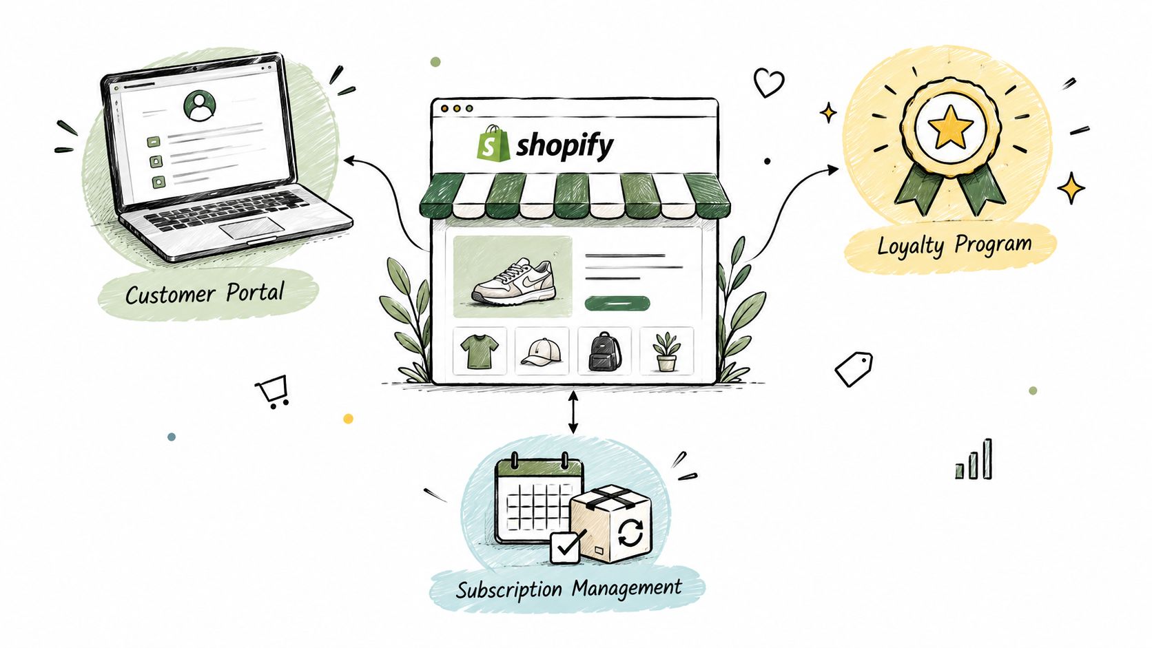
The product page is the entry point, not the entire subscription experience. A shopper who subscribes will later need to manage deliveries, update payment details, change products, and understand upcoming orders. The theme's visual language should remain recognizable across those touchpoints, even when the management experience uses a customer portal or app-controlled interface.
For a supplement brand, the customer may need to pause a shipment after receiving too much product. A coffee customer may want to change the roast or delivery frequency. A pet supply customer may need to update an address or replace a product size. These actions happen after the original purchase, but a confusing or visually disconnected portal can still make the merchant's brand feel unreliable.
The downstream checks
A theme and subscription app should work together across more than the first transaction:
- Customer management: Customers should be able to pause, skip, swap, or change frequency without needing to contact support for routine changes.
- Payment recovery: Failed payment messages and update links should be clear, branded, and easy to find.
- Loyalty presentation: Renewal points, member benefits, and rewards should fit the same visual hierarchy as the storefront.
- Analytics continuity: The team should be able to connect product-page behavior with subscription orders, cancellations, and retention activity.
- Localization: Widget labels, portal content, notifications, and currency presentation should remain understandable in each market you serve.
Theme compatibility also affects analytics quality. If a quick-add component skips the selling plan or a custom button sends incomplete product data, the resulting order data can misrepresent shopper behavior. Before changing a theme, record the purchase paths that currently matter and test each one after installation.
For merchants who need to understand how storefront interactions connect with acquisition and retention reporting, an attribution platform for ecommerce can provide useful context around the wider customer journey. Attribution won't repair a broken subscription selector, but it can help teams interpret the effect of theme and funnel changes once the technical path works.
The strongest setup keeps responsibilities clear. The theme presents the experience, the subscription app manages selling plans and subscriber actions, Shopify handles the commerce foundation, and the operations team monitors payment, support, and retention signals. When those layers cooperate, a design change doesn't need to trigger a complete subscription rebuild.
Final Takeaways for Choosing Your Subscription Ready Theme
The right Shopify subscription theme isn't the one with the most attractive demo. It's the one that lets the subscription app render in the right place, keeps the selling plan attached when shoppers change variants, and confirms the recurring choice in the cart.
Use this priority order:
- Verify architecture first. Confirm sections-and-blocks compatibility and theme app extension support.
- Test a real product. Use variants, frequencies, and purchase options that reflect your catalog.
- Follow the data path. Check the selector, variant behavior, Add to cart action, cart display, and checkout handoff.
- Review accessibility. Test contrast, keyboard navigation, labels, focus states, mobile layouts, and error messages.
- Check the wider lifecycle. Review customer management, payment recovery, loyalty displays, analytics, and localization.
- Polish the design last. Once the plumbing works, adjust spacing, colors, placement, and messaging.
This order saves rework because it separates a theme's visual potential from its operational reliability. A beautiful design can be refined later. Rebuilding a product form, replacing custom variant JavaScript, or repairing a cart integration after launch is more disruptive.
Start with a theme app extension compatible with your chosen subscription app, then run the complete test flow before approving the design. If the subscription option feels native to the shopper and remains manageable for your team, you've chosen on evidence rather than appearance.
RecurX gives Shopify merchants tools for subscription plans, memberships, bundled products, customer self-service, payment recovery, loyalty, and analytics, with storefront widgets designed to adapt to theme colors and fonts. Test its subscription widget in your product template, variant flow, and cart before you finalize the theme, then visit RecurX to review the platform.
shopify subscription theme · shopify subscriptions · subscription apps · shopify themes · RecurX
Keep reading
- How to Set Up Recurring Payments on ShopifyLearn how to set up recurring payments on Shopify the right way. Covers gateways, tokenization, dunning, retries, and monitoring MRR and churn.
- Shopify Subscription Template Setup Made SimpleLearn how to implement and customize your Shopify subscription template with RecurX widgets, theme matching, and QA tips for higher conversions.
- Subscription Billing Platform Buyer's Guide for ShopifyCompare subscription billing platform options for Shopify. See core features, fees, dunning, and how to pick the right fit for DTC brands.
Start growing recurring revenue on Shopify
RecurX has a free-forever plan and zero transaction fees on every tier. Install in minutes.
Install RecurX free →